
Project name
Amici Padel Retreats
My role
Brand strategy & identity
Project overview
Amici originally approached me looking for a new logo and help attracting the right kind of customers. But an initial discovery session uncovered a bigger challenge: the business had outgrown not just its identity, but the way it was positioning itself. What started as a logo project became a rethink of what the business wanted to be.


Getting everyone on the same court
With four founders behind the business, there were naturally four slightly different ideas of what made it special and where it should go next. Our discovery session helped get everyone talking about the same things; who they wanted to attract, what people were really coming for and what they wanted the business to become.
They realised they were offering much more than simply a padel holiday. That thinking led to a new name, Amici (Italian for friends) and a much clearer idea of the experience they wanted to create.


Building the Amici identity
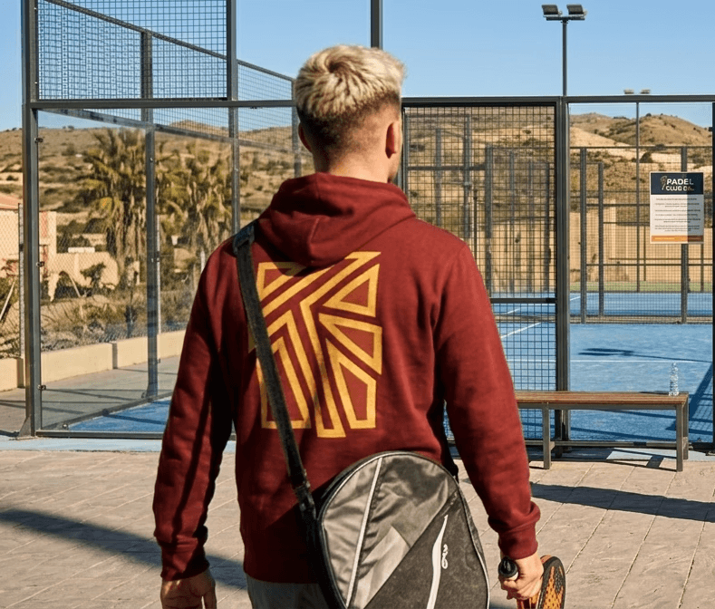
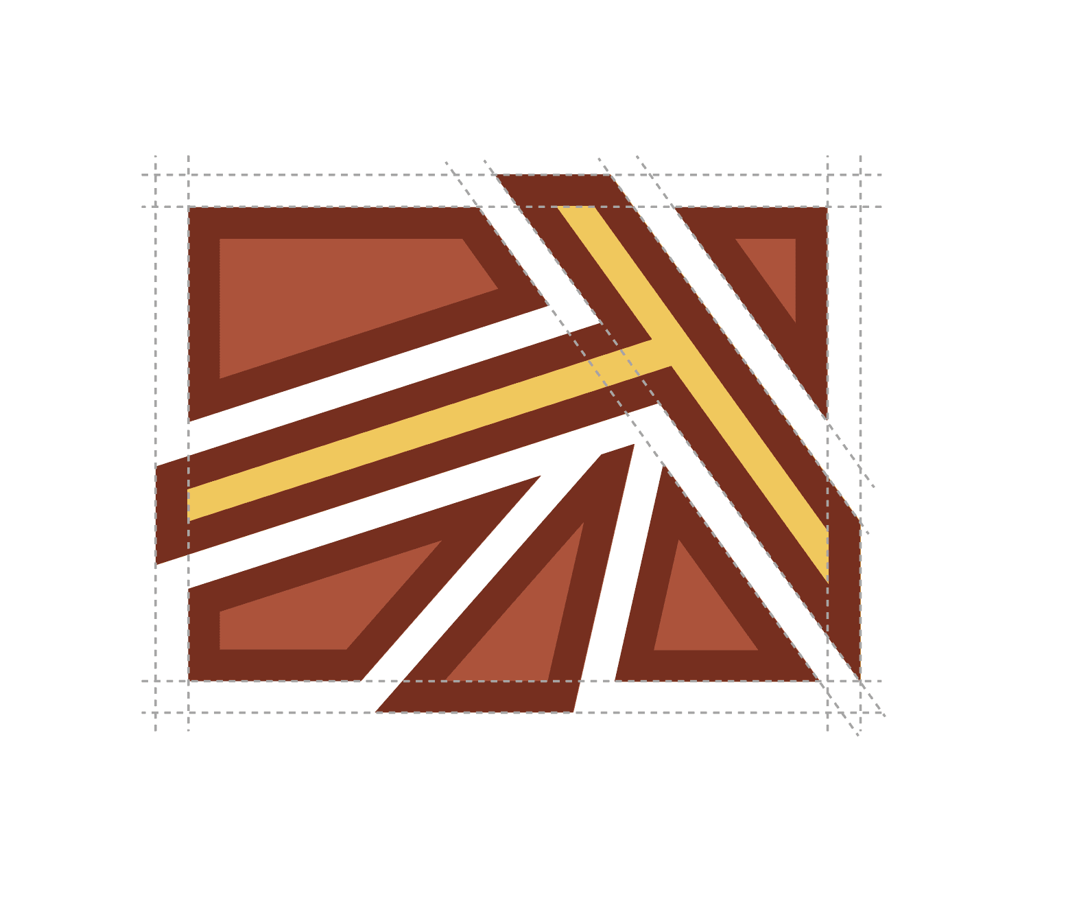
The new identity brings together padel, travel and community. The logo subtly takes inspiration from the lines of a padel court and the warmth of the sun, while its five shards have a deeper meaning: four represent the founders, with the fifth representing their customers becoming part of the Amici community.
From there, I developed a complete visual identity designed to work across the website, social media, clothing, print and exhibition spaces, giving all four founders one brand they could get behind and grow together.


More than a sports brand
The wider identity was designed to capture everything that makes an Amici trip special. Padel is at the heart of it, but so are the destinations, food, friendships and time spent together off the court. The result is a brand that feels energetic and sporty without losing the more relaxed, social side of the experience.


